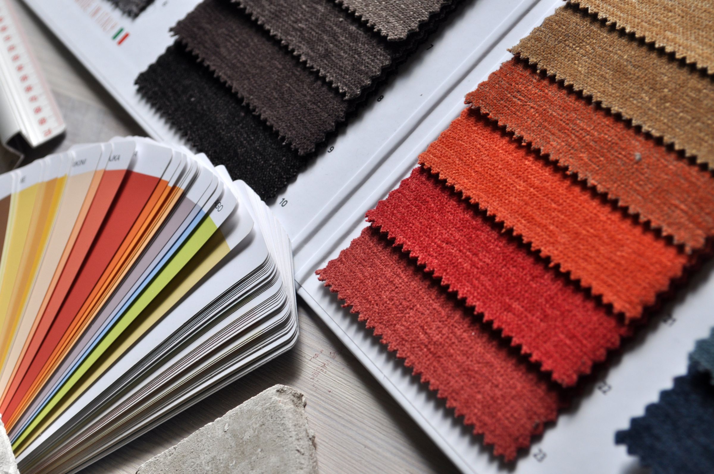
Discover how color psychology in marketing influences customer behavior, evokes emotions, and shapes brand identity. Learn the strategic use of colors to build recognition, guide decisions, and optimize conversion rates.
How Colors Influence Customer Behavior
Have you ever considered why certain brands consistently use specific colors in their logos or advertisements? It's no coincidence—it's a deliberate strategy. Every hue, tint, and shade plays a crucial role in how we perceive brands, make decisions, and even feel emotions.
Welcome to the fascinating world of color psychology in marketing, where meticulous design meets human behavior.
What is Color Psychology?
Color psychology is the study of how colors affect human emotions, behaviors, and perceptions. In the realms of marketing and design, it's a potent tool utilized to evoke specific emotions, influence consumer decisions, and forge a distinct brand identity.
Colors can trigger a wide range of emotional responses—from excitement and trust to calmness and urgency. This is precisely why astute marketers and designers meticulously select color palettes that seamlessly align with their brand message and resonate with their target audience.
Why Color Matters in Marketing
In a visually saturated world, brands often have mere seconds to make a lasting impression. Studies indicate that up to 90% of snap judgments about products can be based solely on color.
Consider color as your silent brand ambassador—it communicates your brand's essence long before a single word is read. Here’s what color accomplishes for your brand:
- Builds recognition – Consistent color use can elevate brand recognition by an impressive 80%.
- Evokes emotion – Colors are masters at creating mood and eliciting specific emotional responses.
- Guides decisions – The appropriate colors powerfully influence perception and purchase intent.
The Emotions Behind Popular Marketing Colors
Let’s delve into what different colors communicate and how they are effectively employed in branding and marketing.
🔴 Red – Energy, Passion, and Urgency
Red is a powerful attention-grabber that ignites emotion. It's frequently used to create excitement, urgency, or stimulate appetite—which explains its prevalence from Coca-Cola’s iconic logo to prominent clearance sale banners.
- Best for: Food brands, entertainment, and sales promotions.
- Emotion: Passion, action, excitement, urgency.
🟠 Orange – Confidence and Enthusiasm
Orange harmoniously blends the vibrant energy of red with the inviting friendliness of yellow. It’s bold, youthful, and brimming with personality. Brands like Fanta and Nickelodeon effectively leverage orange to convey creativity and fun.
- Best for: Lifestyle, entertainment, and youth-oriented brands.
- Emotion: Playfulness, warmth, and excitement.
🟡 Yellow – Optimism and Cheerfulness
Yellow radiates happiness and optimism, instantly capturing attention. However, in large applications, it can become overwhelming, prompting designers to often use it strategically as an accent color.
- Best for: Brands aiming to appear friendly and energetic, such as McDonald’s or IKEA.
- Emotion: Positivity, joy, and friendliness.
🟢 Green – Balance and Growth
Green embodies nature, growth, and harmony. It is widely adopted by eco-friendly, wellness, and finance brands because it effectively evokes feelings of stability and renewal.
- Best for: Sustainability, health, and finance industries.
- Emotion: Calm, balance, trust, and prosperity.
🔵 Blue – Trust and Dependability
Blue stands as one of the most universally favored colors. It communicates reliability, calm, and professionalism. Leading brands like Facebook, PayPal, and Samsung consistently rely on blue to foster trust and convey security.
- Best for: Tech companies, financial services, and healthcare.
- Emotion: Safety, loyalty, and calmness.
🟣 Purple – Creativity and Luxury
Purple skillfully blends the stability of blue with the energy of red, symbolizing creativity, sophistication, and luxury. It is frequently chosen by beauty and premium brands such as Cadbury and Hallmark.
- Best for: Beauty, luxury, and creative industries.
- Emotion: Elegance, mystery, and imagination.
⚫ Black – Power and Sophistication
Black is timeless, bold, and inherently powerful. It is used to convey elegance, exclusivity, and authority. Consider the impeccable branding of Chanel or Apple—minimalist design delivering maximum impact.
- Best for: Luxury and high-end brands.
- Emotion: Strength, sophistication, and confidence.
⚪ White – Simplicity and Purity
White is intrinsically associated with cleanliness, spaciousness, and clarity. It is often employed to create minimalist designs and effectively highlight other elements. Brands like Apple and Nike masterfully use white space to emphasize simplicity and innovation.
- Best for: Tech, lifestyle, and health brands.
- Emotion: Freshness, purity, and simplicity.
Using Color Psychology Strategically in Design
As a designer, selecting colors transcends mere aesthetics; it's fundamentally about what resonates emotionally with the target audience. Here are several key principles to bear in mind:
- Know your audience – Different cultures interpret colors uniquely. For instance, red might signify luck in China but can evoke danger in Western contexts.
- Balance contrast and harmony – Employ contrasting colors to command attention and harmonious palettes for seamless visual flow.
- Stay consistent – Maintain unwavering color consistency across all platforms to powerfully reinforce your brand identity.
- Test and analyze – Rigorously A/B test color variations on buttons, banners, and advertisements to determine what drives superior engagement and results.
Color and Conversions: The Psychology of Clicks
Colors don't merely shape perception—they directly impact conversion rates. For example:
- Red Call-to-Action (CTA) buttons frequently drive urgency and action (e.g., “Buy Now”).
- Green buttons are commonly associated with progression and success (e.g., “Get Started”).
- Orange buttons are attention-grabbing and convey a friendly appeal (e.g., “Sign Up Today”).
Even subtle color adjustments can yield significant differences in performance. This is why savvy marketers continually test color variations to optimize user behavior and achieve desired outcomes.
Final Thoughts
Color is undeniably one of the most potent tools in a designer’s arsenal. It silently communicates emotion, shapes perceptions, and influences decisions—often before the customer even consciously realizes it.
Whether you are establishing a new brand or refining your existing visual identity, a deep understanding of color psychology can empower you to create designs that are not only aesthetically pleasing but also connect emotionally and drive tangible results.
So, the next time you embark on choosing a color palette, ask yourself: What do I want people to feel when they encounter my brand? Because in marketing, color doesn’t just decorate—it persuades.